
Monday, September 8, 2014
Switching to Tumblr
Thanks for reading this stuff for that past year and a bit. I'm going to switch over to tumblr because people actually see that stuff. I'll link here for longer posts still perhaps, but if you want to see the weekly posts head over to www.temescuart.tumblr.com. Thanks.
Monday, September 1, 2014
The Killing

Hey! I got this motha done despite the fact that I moved this week. I finally can stop moving every month and I'm officially a Brooklyner person. Bring on the fedoras. If you see me on the street and you don't recognize me it's probably because I'm wearing a fedora.
But The Killing. It is a great noir movie about a heist that hinges on meticulous planning, a clown mask, and the killing of a race horse. It has good characters, and really stands out from a lot of other noir with the way it looks, but also with its nonlinear narrative structure. Showing the same events from different perspectives etc.


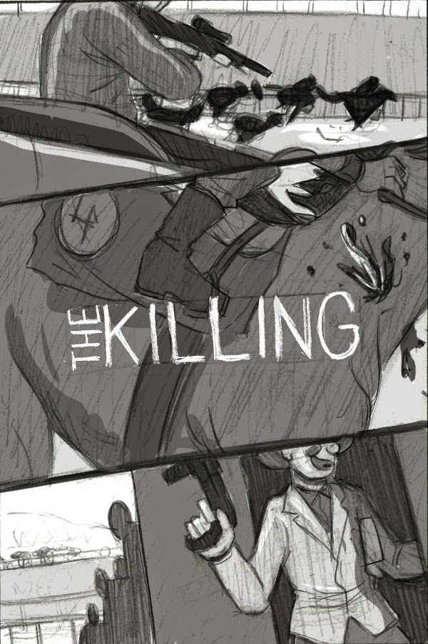
If I'd had more time this week I would've tried some other approaches to the paneled sketch looking at the moment of the killing from different POVs. Maybe three different close ups. I really want to make one of these paneled illustrations work sometime. Anyway. I ended up going with the first idea because it does the best job of showing the symbol and mood that sets The Killing apart from other noir. Even though I probably wouldn't use color to sell this movie normally, I really like finding a palette that works for B&W movies.
Monday, August 25, 2014
The Shining

Here's The Shining. Another movie that's been done to death. I wanted to go with something that had the movie's stillness and suggested its focus on interiority/exteriority. I've seen some really cool looking art about this movie that focuses on the axe. To me that seems wrong. Quiet, foreboding, creepy. This is a movie about a man trying to fight off insanity. Of these two preliminary sketches I wasn't sure, but one I worked them up to finaler sketches I could tell the hotel would be a blast to draw.


Monday, August 18, 2014
Lolita

I'd never seen Lolita before. It's about a man who pursues a relationship with a teenage girl. I ended up reading a lot about the book and how Kubrick went about adapting it. The more I pay attention to Kubrick's movies though the more impressed I am by his ability to build a narrative without moralizing. Lolita is a pretty disturbing movie in a lot of ways, but the characters are interesting and the story builds them very well. Still a real creepy movie. I should read the book. It seems like Nabokov inspired bits from a lot of fiction that I like. Oh, and here are the preliminary sketches.


Tuesday, August 12, 2014
Barry Lyndon


I mean just look at this still from the movie. So clearly composed as a painting. This is a little more Caravaggio than most of the film, which Kubrick has said is made to look more contemporary to artists like Watteau and Hogarth (apologies for the awful color on the Hogarth)


The thing I really did enjoy about this movie though was the subtle undermining a lot of the normal period drama beats. Kubrick subverts the whole thing with a deeply ironic narrator and characteristic grimness. These elements reveal the artifice behind the lavish settings and characters to expose a real human tragedy.
So I made a lot of sketches, but many of them stuck pretty close to things I've seen a lot or these types of paintings. Stuff that would work, but didn't necessarily betray the underlying tone of the movie. I decided to subjugate that approach with more of my own interests and tendencies and came up with this.

This idea did a better job framing the classical painting composition within a more modern discomforting treatment. It suited the tone of the film much better. And apart from a few little tweaks with color and composition I stuck pretty close to this. I spent forever drawing that type perfectly, but then abandoned that for the stand-in type I did with a dip pen that's in the final. Too many words.
Tuesday, August 5, 2014
Comic Characters
Been doing some storyboard work, so I've just got some sketchbook stuff. Characters from comics I like. Had another I liked, but it got ruined, so just Die Hard from Prophet, and Hellboy from Hellboy. You get it.


Monday, July 28, 2014
Quick Doom
Here's Doom. The mask is the man. Might mess with the colors more later.


Edit: Remember how bad that looks? Spent another couple hours and made it anew. This is better. This color is still a little funky, but it has a more serious villain vibe, and it does a lot better job stressing the difference between Dumile and the character DOOM. At least I think it does.
Edit: Made some more minor changes.
Subscribe to:
Posts (Atom)